Flat Coke – Art on Bitcoin

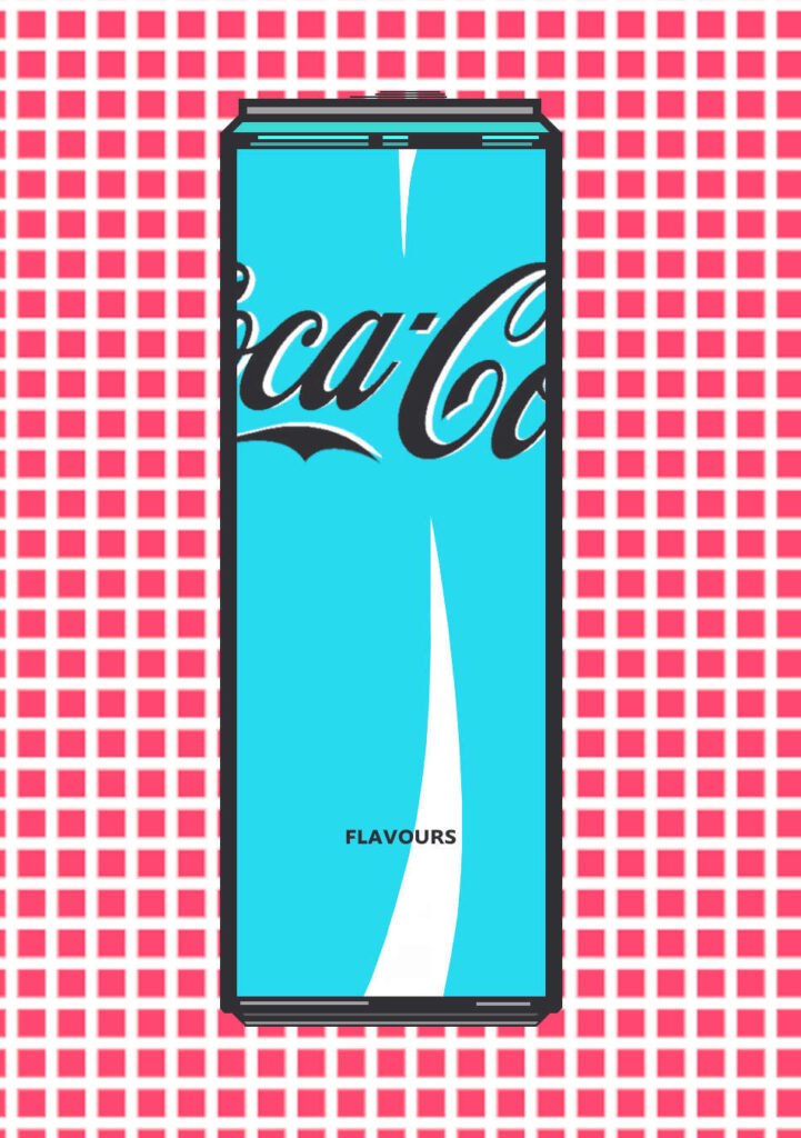
Flat Coke is a series of works that subtly portrays a dimensional shift from a three-dimensional Coca-cola can to a two-dimensional view, hence the word-play title, ‘Flat Coke’. Each piece in the series is inscribed/minted on the Bitcoin blockchain.
Flat Coke – The Concept
As I’ve mentioned in my article ‘How I Found my own Art Style‘, this series was created after I realized a long held ambition of finding a particular aesthetic and subject matter. Part of the subject matter focus is in dimensional shifts that have often been a part of my previous art work.
Combining the Pillbox patterning with the large areas of solid color with a subject-matter of Coke – and then creating other concept can designs – became the desired goal.
For me personally, this created a rather iconic look and feel of a well-known product, but with the added vision of new potentials of color and concepts within the original form. The original drawing became a useful template structure and form to then springboard to various visual potentials from.
An interesting thing about this series is trying to imagine what certain flavours like Jolly Roger and Bitcoin would actually taste like. If you’ve ever seen a new flavour of Coke, you, like me, will probably just buy it to try the flavour to see how well it combines with the usual Coke flavour. There’s a certain sense of wonder and curiosity surrounding new Coke flavours that I’ve tried to capture the feeling of within this series.
Pieces in the Series Flat Coke
I’ve personally found that there are different kinds of art series, some seem to almost describe themselves one after the other in a relatively short space of time and with a clear ending to the series, while other series you can’t force. The pieces happen in your mind when you’re not really thinking about them over what could be a period of weeks or months. Flat Coke has been one of those series of works for me, and still has other pieces to be added.
Due file size restrictions on Bitcoin, the majority of artwork on the chain is made up of small file sizes. Depending on where and how you are minting, most file sizes don’t go beyond 350kb, and the larger the file size, the more expensive it is to inscribe. With this series, I wanted large file sizes as image quality really suffers below a certain canvas and file size. Hence, Flat Coke has image canvas sizes of 950 x 1350px and up to 256 kb in actual file size in order to do them justice.
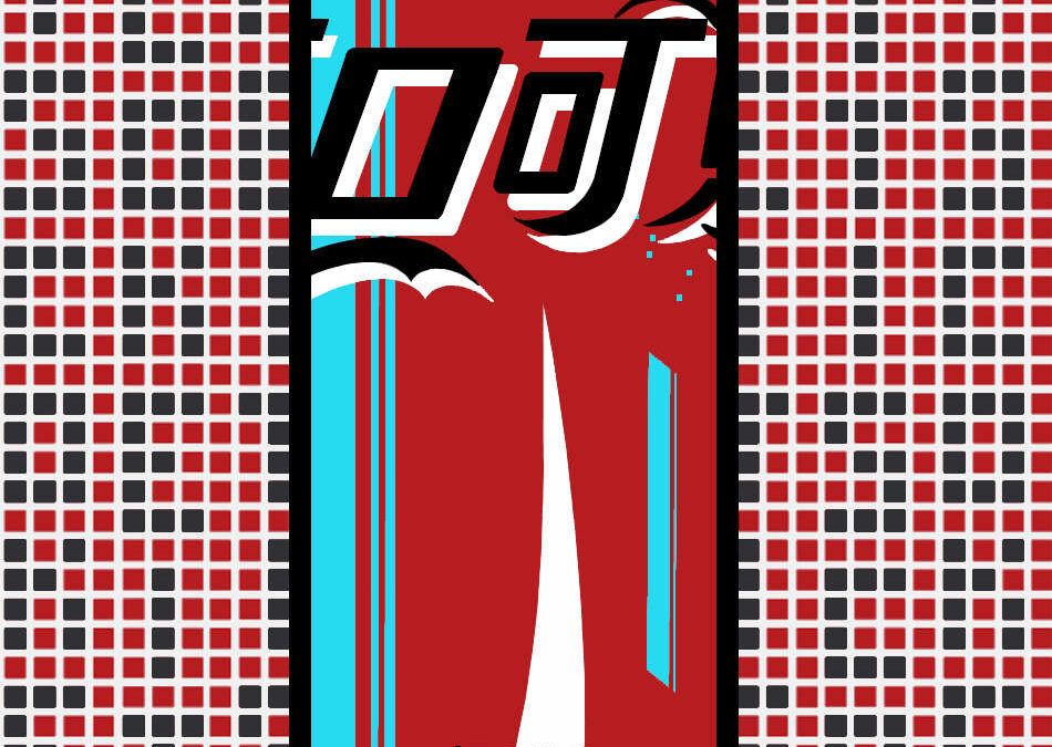
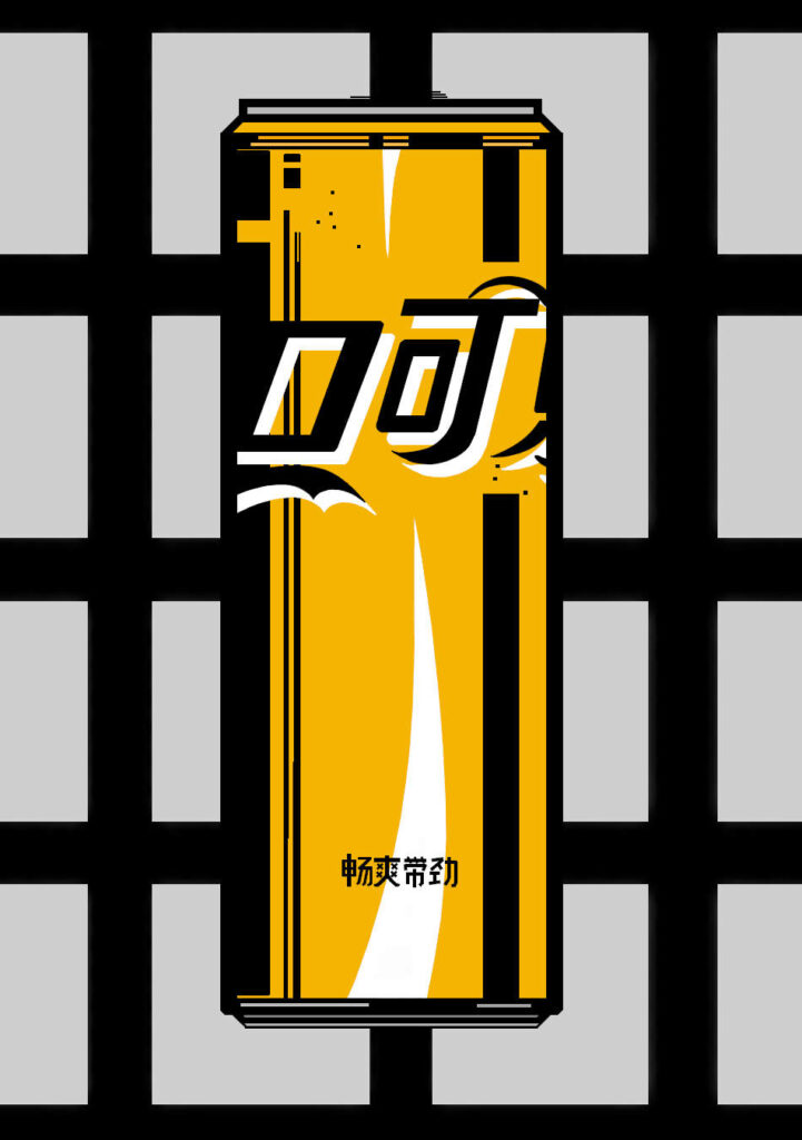
1. It is Coke
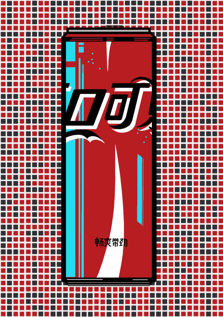
I’ve always liked Chinese characters, they have that kind of futuristic Bladerunner feel to them (yes I know, mostly Japanese Kanji was used in Bladerunner, but Kanji is basically Chinese characters with some alterations in some cases, and some difference in meanings depending on the character) So with the first piece ‘It is Coke’ (80’s slogan disambiguation) I’ve used the Chinese characters, as well as on some of the others. For the first piece, the slogan disambiguation is also featured on the background.
2. Peach Coke
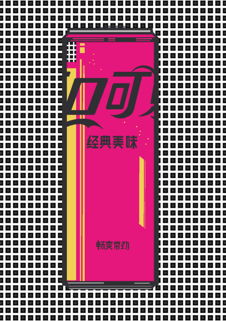
As far as I’m aware, there is no Coke can that actually looks like this one does. But the color combination of yellow and pink really set something off for me, visually speaking. Peach Coke does actually exist, and if you like the flavour of peach and Coke, you’ll probably be into it. I call this the ‘Happy Can’, because every time I look at it, the colours just make me feel like it’s Summer (which it currently is as I’m writing this). I pondered for some time as to why I chose this colour combination and finally realized that they were pretty much the same colors of a chewing sweet from my childhood (as far as I remember called, ‘Fruit Salad’). It’s funny how certain things live in your subconsciousness just waiting for an opportunity to pop-up again just like this did.
3. Cyan Can
Cyan Can Coke doesn’t exist in this area of the multi-verse. To be honest with you, it seems to me that the inspiration for this one came from another can design I’d seen years before, that of the Japanese energy replacement drink, ‘Pocari Sweat’, which in and of itself has a knock-off of the Coke can design, but in a darker blue with white. Either way, there was something about about the cyan and pink Pillbox background, along with a more minimalist look compared to some of the others that really did it for me. Somehow, I imagine the taste would be either slightly menthol, or blueberry.
4. Bro Coke
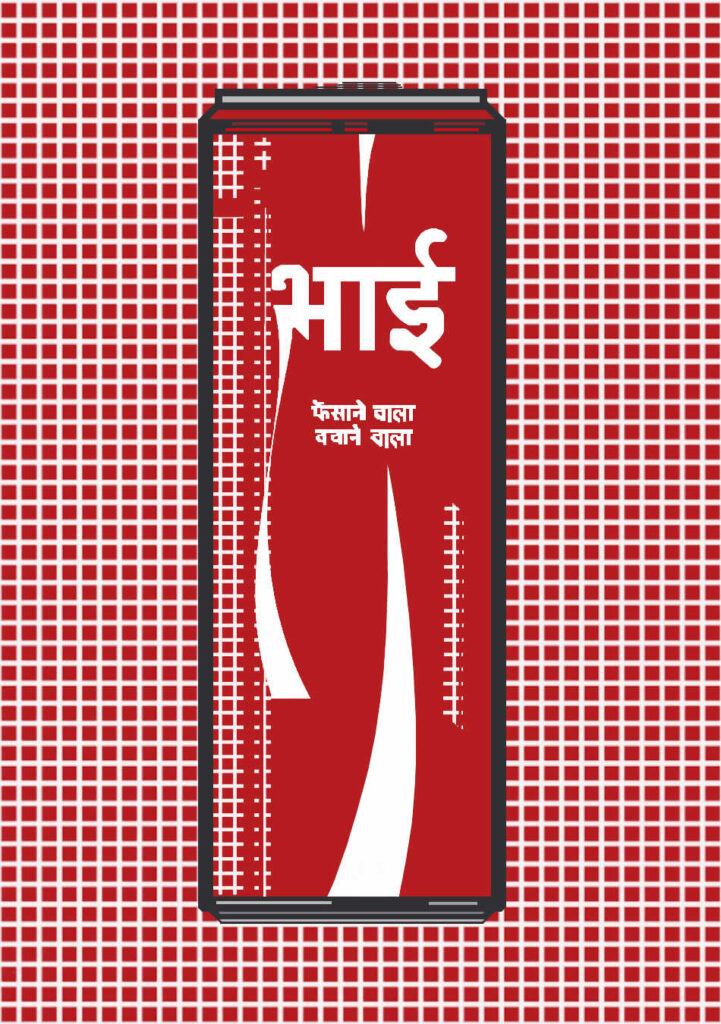
Bro Coke was an actual promotion of Coke in India, but on bottles. As far as I’m aware, it didn’t exist in can form. Different family members titles were used in Hindi. ‘Bro’ was one of the others that was used. This one is presented as an intense red throughout the piece. I’m particularly happy about the swoosh I’ve added coming off of the Hindi characters on the left. I’ve made the shine areas with the Pillbox pattern look as if it’s showing a reverse magnification of the background, I rather liked this effect and it adds to the striking appeal of the entire piece.
5. Cherry Coke
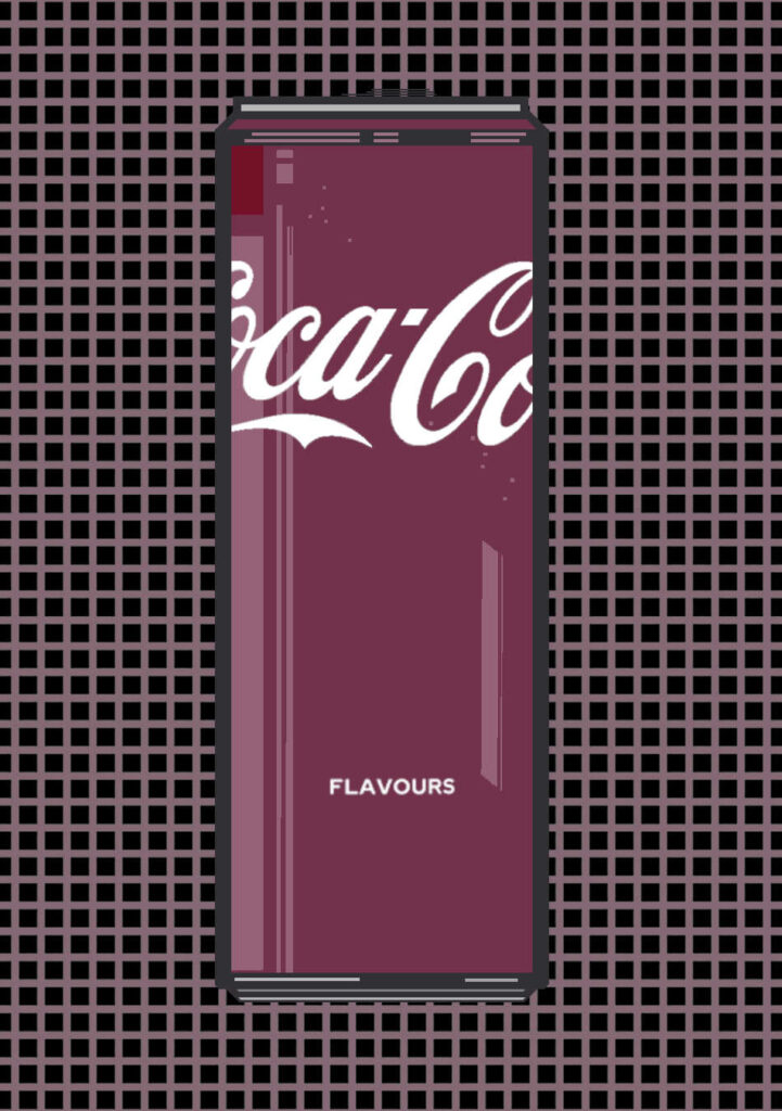
Cherry Coke has a special place in my heart, but I’ve found that people either love it, or… kind of don’t. No matter how much I extol its taste virtues, the non-believers simply won’t budge. Oh well. For this piece I used what I refer to as a filled Pillbox patterning. Basically, what would usually be the white area between the pillboxes contains colour, instead of just the standard white. This visually brings the can and the background closer together. I added a nice pure cherry red shine cell on the can to really set it off. I think I’m biased as I like Cherry Coke, but this is one of my favorites.
6. Lime Coke
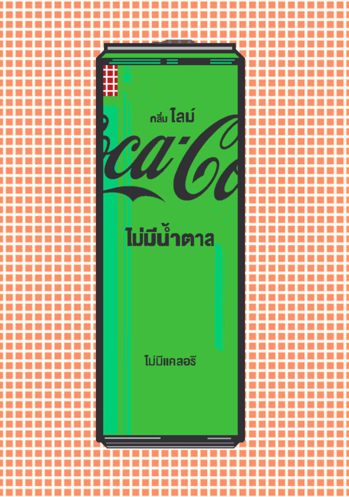
Lime Coke is based on the Lime Coke can from Thailand, and is more-or-less exactly as it looks like in real life. I’ve added a kind of glitched Pillbox color shine in the top left to give it some stark and almost sudden contrast effect. To me, it gives the can a kind of disembodied feel to it, a form of anomaly that shouldn’t exist, but does.
7. Vanilla Coke
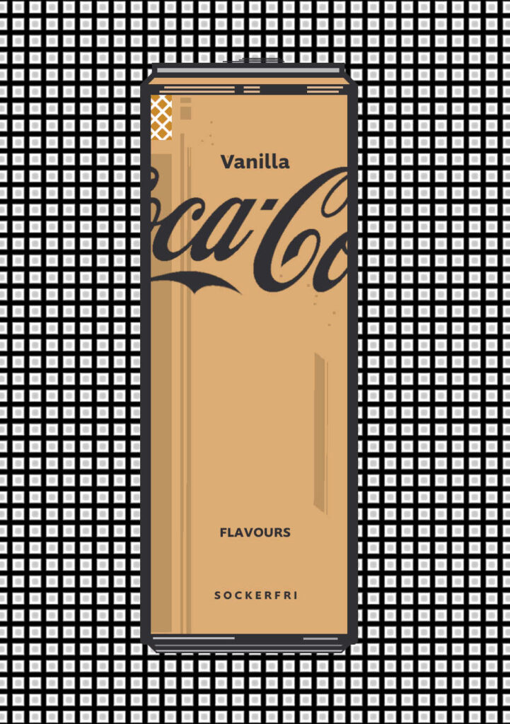
Vanilla Coke uses the sugar free ‘Sockerfri’ text from the Swedish can design. The Pillbox pattern background has been inverted black and white to give a type of industrial-tech gridwork feel to it. I really like the subtle off-yellow colors of the original can and extended a darker shade of the colour to the shine areas on the left. I’ve gone for a bit of a wildcard with the top left shine area by turning the Pillbox patterning diagonal-wise, which gives a nice contrasting visual feel, kind of like what would be a sudden and unexpected flourish of a brushstroke that sometimes happens via inspiration when you’re painting and in the flow state. It should probably be pointed out that I’ve used the black Coke text – which would usually signify the sugarfree version – on quite a few of the cans that aren’t actually sugarfree, simply because it gives a nice stark contrast as opposed to the white text which I feel sometimes doesn’t.
8. Bitcoin Coke
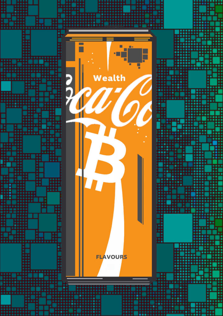
What is the taste of wealth? I’d say Bitcoin, for the simple fact that Bitcoin always increases in buying power over the macro chart time frames, unlike fiat currencies which are by their nature designed to lose buying power via inflationary policy. This is the only one that rather than using the Pillbox pattern as a background, uses the Bitcoin memepool with some color tweaking. A memepool-esq icon has been added to the top right of the can too, to give the design some extra flavour, you could say.
9. Game of Coke
Most know I’m something of a Bruce Lee fan for a long time, and this piece came about when using the Pillbox pattern suggested itself to Japanese screens that have opaque ricepaper over them. It was then really just a short memory jump of remembering the pagoda scene in Game of Death where at the end Bruce Lee is punching his hands through the paper to see the outside world. And who can forget the yellow and black tracksuit he wore, either. So this piece has the black stripe on the right as well as the iconic yellow of the suit. Combined with those two colours, is the white of the Coke swoosh as well as the letter backing that really brings out the whole effect.
10. Jolly Coke
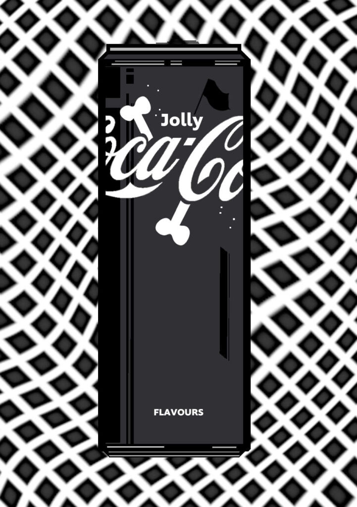
The concept behind Jolly Coke started with the idea of creating a very dark looking Coke can which I can’t say I’ve ever seen before. Then it naturally followed as a concept for the Jolly Roger pirate flag. My self set goal was then to create the Jolly Roger ‘without’ a skull, but with everything else that would lead the human mind to thinking about it anyway. The background has the Pillbox pattern warped to at the same time give the feeling of a flag and the waves of the sea. Also, the line under the word ‘Coca’ has been flipped to give the appearance of a wave.
11. Jolly Coke Red
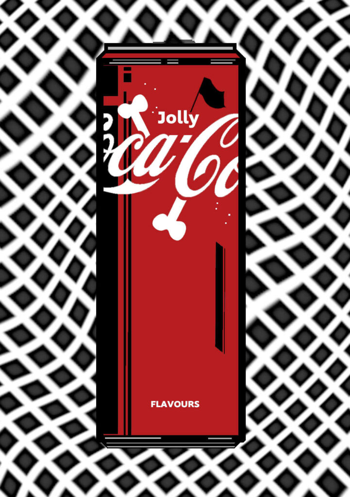
This one really looks nice. It wasn’t supposed to initially be in the series, I just created it for my own curiosity and pleasure – and for the sake of seeing what the colour variation would look like. But, the more I looked at it the more I wanted it, and so here it is as a nice addition to the line-up. It takes the classic Coke red colouring and takes it down a whole new avenue of expression…
Flat Coke is inscribed to Bitcoin and is available in its own collection, ‘Flat Coke’ on Gamma – Bitcoin