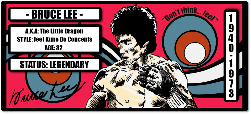
The Bruce Lee Sidekick card is the earliest instance of a Bruce Lee NFT on Bitcoin, as the underlying name asset NFT ‘BRUCELEE’ is a one of a kind possibility on the CounterpartyXCP protocol, where tokens can be minted and utilized for various use cases with the data then written to the Bitcoin network, but only one of each name/letter combination can ever be minted.
Just as he was unique, the NFT is a singular 1 of 1. The artwork is also inscribed on-chain to the Bitcoin network at Ordinal Inscription #145,177.

In 2015 when I was minting NFTs as name assets on the CounterpartyXCP protocol, the first platform that enabled the creation and tradability of NFTs on Bitcoin – or anywhere else for that matter – I was really surprised that the NFT ‘BRUCELEE’ hadn’t already been taken, even though back then few people were in the NFT space.
I didn’t have many childhood heroes, but Bruce Lee was one of the few. If you asked me a random question about his life, the chances are I’d know the answer. So after owning that NFT for so long, I decided it was about time I graced its existence – and his – with some artwork that would be fitting.
Bruce Lee Card Concept
For this piece I wanted to do something a bit different. On the CounterpartyXCP protocol, the vast majority of works are collectible cards, that’s how the NFT movement as a whole started. And, as everyone knows, collectible cards are always upright in a portrait orientation, so I made the decision to make the BRUCELEE NFT a sideways orientated collectible card.
Note: By the way, if you’re not already familiar with the CounterpartyXCP protocol, the caps-lock of the BRUCELEE name is by the design of the protocol, not my shouting version of telling you the name 🙂
Bruce Lee the man, was iconoclast in all he did, and I wanted his card to be also. I can’t ever recall seeing a sideways orientated collectible card, neither physical or digital. I’m not saying there might not be one somewhere, but I’ve not seen it.
Due to the card’s orientation, it’s also got its own name, ‘The Sidekick Card’. If you’re into Bruce Lee you’ll of course know his sidekick was known to be epic. There’s a story James Coburn told of seeing Bruce do his sidekick on a heavy bag when they were training together, and the heavy bag getting ripped off of its fittings and sent flying. This is another reason why The Sidekick Card is, to me at least, a fitting name.
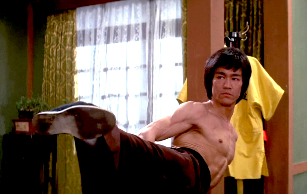
Before I got into the conundrum of what a sideways orientated card structure might look like, I had to decide on the style of the Bruce center piece. I spent a long time looking at different photos that I’d, frankly, seen hundreds of times before, looking for the one I wanted to do. After a while, I realized as much as I still liked them, they weren’t doing much for me in view of using them for the card. If I’d seen the image propagated widely before, I didn’t want it.
I ended up pulling a selection of cells from Enter the Dragon and slowly going through them frame-by-frame before fixing on a side view of Bruce that showed his angular physique well. The mid-shots where he’s more-or-less facing the camera are the images commonly seen all over the internet. But, sideways, much less so.
You will be unlikely to find the exact shot from his fight in the Shaolin Temple with Sammo Hung that matches it, because I changed his mouth from closed to open, and removed part of his arm and hand, to instead give him the gait of a boxer baiting his opponent with his lead arm down (Many think Bruce Lee never fought competitively, but he actually boxed in Hong Kong when he was younger, and won.)
The other important decision, was what would the style of the drawing of him be like. I settled upon a style of drawing I haven’t done in quite a few years, basically, I sketched him in the same manner as I would have done on paper (but digitally with a stylus and tablet) in a rather rough manner before then gradually working in more definite details with darker lines and shading. If you look closely, you can still in some places see the outlining in grey I initially used. It’s been left in deliberately, as this not only gives it a raw yet defined look that I think suits the overall feel of the man himself, but also gives a muti-layered aspect to the drawing that he also had in his own personality.
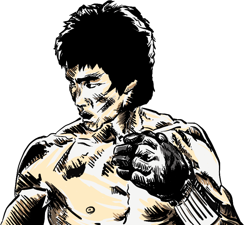
The other parts of the structure that have been changed to his form slightly, are the side of his jawline which I’ve given a bit of an extra angular superhero jawline to, and his left trap where I’ve also added a bit of artistic licence. Funnily enough though, the actual front jaw itself is pretty much as defined as it is in the drawing, which was something I’d never actually noticed before in all the pictures I’d seen of him, perhaps because most were front-on(?) Bruce Lee was actually one-quarter German on his mother’s side.
One of the things that occurred with the drawing that I hadn’t actually intended, was that because I was keeping the drawing loose in execution as I made the strokes more from an instinctive feeling while keeping the overall goal of the piece in mind, was that on his cheek and middle chest he ended up with what looks like the cuts from Han’s claw hand that he gets only later in the hall of mirrors scene. One of those creative extras your subconscious throws in when you get in the flow, no doubt. Not intentional, but I liked it and kept it.
I have to admit, it’s not the first time I’ve drawn Bruce’s musculature. In fact, I had to use his images for some years to actually help study human anatomy when my college only supplied us students with nude, male life models with no muscular development.
If you get a female life model, it’ll almost always be beneficial to your practice, but men, almost not at all past a certain point – if they have no muscular development. You may say you still get to learn to develop the proportioning of male arms, torso and legs, etc. but I’d argue that I’d learn that (and more) from just drawing women and only needing to make slight alterations. For the eternal question, ‘Which came first, the chicken or the egg?’, the answer is a definitive, ‘Women’. What defines a man are just add-ons in the manner of throwing a spoiler on the back of your car (physically speaking). The car already worked, the spoiler wasn’t necessarily-necessary, useful perhaps, but non-essential (and yes I’m a man, and this realization might have hurt my feelings if I could have been bothered to think about it too much – which I can’t).
So the long and short of it is, you don’t learn much from drawing men with undeveloped musculature, and it actually becomes a waste of your time. You won’t go far wrong with Bruce’s physique in Enter though, if you want a bit less ripped with more muscle mass, then go Big Boss.
NFT Card’s Background
To be honest, it’s probably only some real nerd-level Bruce Lee fans (such as myself) who will recognize what the card background actually is. I’d initially tried several different structures I liked the idea of, but just wasn’t feeling it…
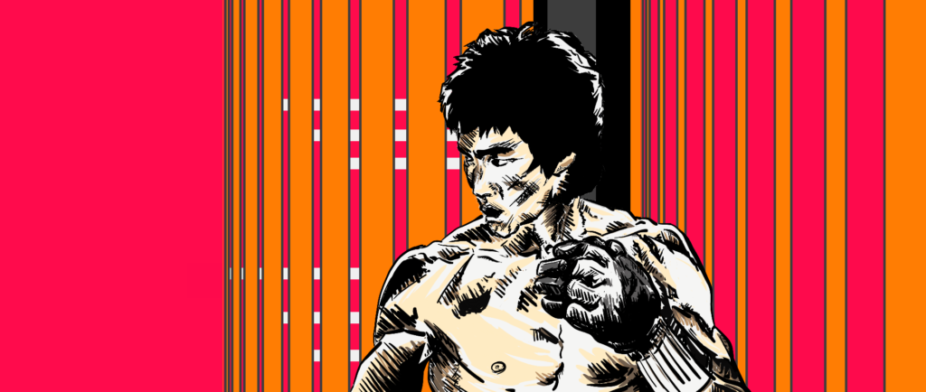
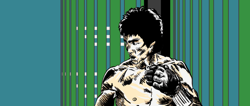
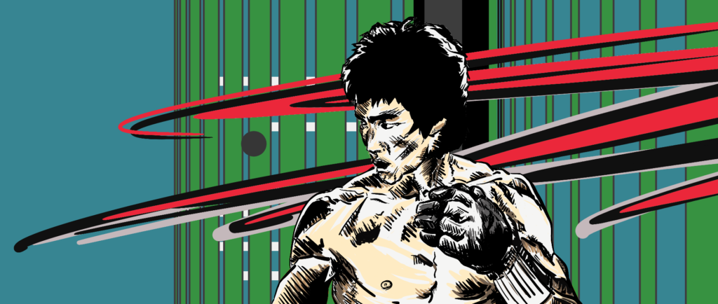
It was then I remembered something I’d read somewhere. The last place Bruce Lee lived was at 41 Cumberland Road, and outside on the wall – and still surviving today – is a mural that he, himself, designed.

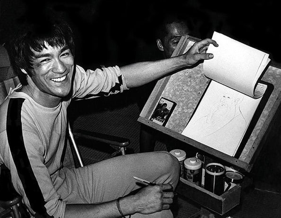
It’s a little known fact that he could also draw, he often did sketches that showed techniques – especially in his book The Tao of Jeet Kune Do – and some character based illustrations. I figured, what better to go on the background of a Bruce Lee NFT immutably attached to the Bitcoin blockchain than his own work. It’s also a nice way to make him feel at home (haha).
The color of the background was also a particular choice. You may find it an unusual color to choose, and you may or may not also be seeing it as it’s intended to be depending on your screen’s settings. The color isn’t pink, it’s Cerise (well okay, that is a kinda’-sorta’ pink). Why? Cerise has a large amount of red still within it, and red has always been (in the Western world), considered to be a martial color (Mars-Martial, red, the red planet, blood, etc.) Red for Chinese is also lucky, as the bad-boy demon ‘Nien’ is scared of fireworks and the color red. But, to have it as just a pure red loses something in my opinion, it loses nuance.
There is a little understood concept of the void, where all comes from and returns. Now, depending on where you’re coming from, the void is either a solid black, or the purest of white. So in this case, what happens when I mix some white void with the red? You guessed it, I get Cerise. And Cerise has a nice balance between red and white, more so than any other shade between the two, I’d say.

Martial techniques based on the void are their own particular thing (or everything, or nothing at all – bad Daoist joke), they are what happens suddenly and effectively without your seeming volition when you are either a master or an absolute beginner, but not often anything in-between. As Bruce himself once said when asked what his defence would be in court if due to his reactions being so highly developed he suddenly hit and killed a man who had attacked him, “I don’t hit, ‘it’ hits. So my defence would have to be, ‘not-guilty’.”
Art and the void are also very close cousins by the way, perhaps the closest, by some metrics at least.
The Card’s Structuring
As I knew what the background was, and of course the foreground, then I realized I had another problem. Putting the Bruce Lee image just off to the side in a box – as in just turning a usual collectible card on its side – just wouldn’t have worked well. The impact of the Bruce image is lost as its size is reduced, and not only that, but so is half of the background.
So the issue was, he had to be in the center of the card, and also the background still needed to show, even though an area of the card needed to be used for card attributes, or in this case, his attributes.
I spent a few weeks banging my head against a brick wall with that one, believe it or not. How to have an area that will be used for text but which also still allows for the background to be seen. I came to the conclusion that I needed something that was there but at the same time, not there. You may say I could have had the text-box area a bit transparent, but I tried it, and with the text, it just looked bad.
In the end, my solution was to create a set of text boxes that more or less seem to hang there, with enough of the background being visible so that the human mind knows how to fill in the details itself, so to speak. For some reason, they remind me of signs at a bus station that would be linked with hanging metal rings and can be changed depending on destination information, departure times, and so on. I’m not sure I’ve ever actually seen those, but I somehow feel like I have.
Bruce Lee’s Signature
The interesting thing about the Bruce Lee signature on the card is that it doesn’t exist, but it does, but it doesn’t. What do I mean? Well, it’s entirely possible to find a Bruce Lee signature with a transparent background that you can just slot into the work, but where’s the fun or originality in that?
So, there was only one logical choice left: practice his signature hundreds of times until I could do it without thinking. And so that’s what I did. Really.
It was only when I started doing that, that I then began to really appreciate my younger self forging my mother’s signature on sick notes when I’d fancied a day off. That practice came in handy when making Bruce’s signature (not for my teachers before, though).
Bruce’s signature changed over the years, as all of ours often do, and of course, no two of his signatures are exactly the same. In his Green Hornet days, his signature was more-or-less legible, whereas by the seventies it was looking more and more like the handwriting on a doctor’s prescription note. Easy thing to happen when you have to give out your autograph hundreds or thousands of times, or more. So, for the card’s sake, I went with his more legible circa late 60’s signature style.
I then spent quite some time studying what the underlying structure and movement of his handwriting was in view of his signature before I even began trying to replicate it. You may ask yourself if you’re an artist, ‘Why didn’t you just trace over one instead’. The reason for not doing that is you lose the flow and intention within the strokes themselves, and mostly you’ll end up with a signature that’s trying to look like a natural signature, as opposed to one that actually is. Not saying it’s impossible though, but it would in my view still require just as much practice as the way I chose to do. Maybe, maybe not (?)

Bruce Lee NFT Card Text
Within the card box at the top, we of course have his name. In the main text box, I went for his commonly used nickname/A.K.A, ‘The Little Dragon’. It was more than a little tempting to add the nickname he had as an infant too, ‘Little Phoenix’, a girl’s name given to him to trick bad spirits who are – in Chinese belief – always trying to steal away male offspring. I would have added it had I had the space. A name by any other name, is still a name… especially when given to you by your mother. It would have been nice to have included his actual given Chinese name too, Li Jun Fan, but again, space restrictions.
Some may wonder why beside the category for style it says, ‘Jeet Kune Do Concepts‘, it’s because styles without development or change were the antithesis of what he was doing or taught, they also don’t fit people across the board, either. Jeet Kune Do is a set of concepts whereby the individual learns what his own Do/Dao/Way is, not really a fixed system of techniques.
His age is self-explanatory I’m sure, especially combined with the years 1940 to 1973. He peaked like few do, and was gone all too soon. ‘Status’ could only be ‘Legendary’, and I’d find it hard to argue otherwise. You’d have to travel far off the planet to find a country where the people don’t know his name.
And lastly, the text, “Don’t think… feel.” He wrote this part of the Enter the Dragon script and pushed to have it included, along with the dialogue in the scene cut and in later years re-added where he speaks with the Shaolin abbot.
So there you have it, The Bruce Lee NFT – The Sidekick Card. The original NFT minted in 2015, and then the image included and inscribed forever as Ordinal Inscription #145,177 on Bitcoin.
As right about now it’s 5:20am as I finish writing this, it’s time for me to enter the void, otherwise known as, ‘the bed’.
The 2015 Bruce Lee NFT is viewable on CounterpartyXCP, or you can see the on-chain inscription on Bitcoin Note: The size of the file on Bitcoin had to be greatly reduced due to block size restrictions on the Bitcoin network (Original file size is 1830x838px at 5.87MB)
